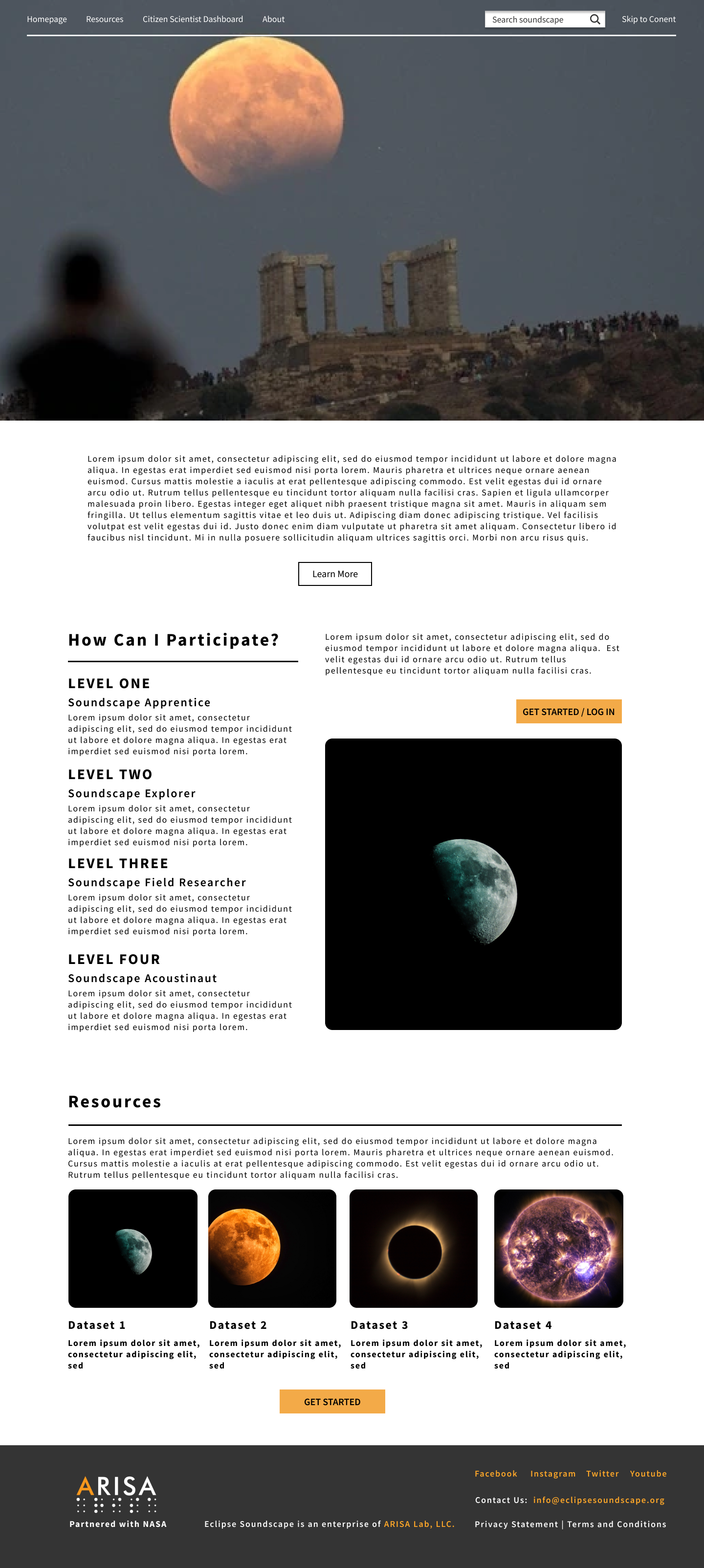
NASA Eclipse Soundscape
ARISA Lab x NASA X NYU
Instructor: Prof.Regine Gilbert at NYU, ARISA Lab
Duration: Jun.2021 - Dec.2021
The research is based upon work supported by NASA under project Eclipse SOundscapes: Citizen Science Project, award No.80NSSC21M0008.
OVERVIEW
The project aims to create an accessible learning environment with opportunities for citizen scientists to participate in authentic scientific research on how eclipses affect life, specifically soundscapes on Earth.
MY ROLE
With Professor Gilbert's guidance, I worked on:
1) Conducting research on web accessibility and inclusivity for the blind and low-vision communities;
2) Administering surveys and interviews with the blind and low vision communities, and documenting findings for further study;
3) Communicating with the multidisciplinary team including sponsors, developers, project managers, and data scientists.
PROBLEM STATEMENT
How to create an accessible learning environment and sound data navigation experience for the visually impaired?
BACKGROUND
Web accessibility is part of digital inclusion. It specifically refers to how browsers, websites, apps and other digital infrastructure can be used by people with auditory, cognitive, neurological, physical, speech, and visual disabilities.1 The World Wide Web Content Accessibility Guidelines (WCAG)2 are detailed standards that help developers build applications so all users can perceive information and functionality, operate interface controls, understand the content. According to the WCAG 2.02, there are four principles: perceivable, operable, understandable, robust. Based on these principles, the techniques listed below will help improve the accessibility in data visualization1:
1. Color: Use colors with a high contrast ratio and consider what additional visual cues could differentiate variables;
2. Interaction: Users should be able to do anything using a keyboard that they can do with a mouse. For data visualization, that might include a tooltip that shows on hover, or a filter that is triggered by a click. If a user navigates through the data visualization with a keyboard, they should be able to do so in an order that makes sense. Users should be able to exit this interaction and not get stuck in a loop;
3. Animation: Do not use flashing images. Users should have control over the timing of animations;
4. SVG Interactive charts:Interactive charts made with scalable vector graphics (SVG) can support features like keyboard navigability and labels for screen readers;
5. Providing summaries: Use alt text to provide a one-sentence summary of the chart since there’s enormous cognitive load in consuming large amounts of data, so the reader can decide if they want to drill in. Do not make the readers walk through each cell of a table.
RESEARCH METHODS
In order to further understand how the visually impaired access websites and navigate data, two research methods were applied: survey research (including questionnaires and interviews) and competitive analysis.
1. Survey research: Questionnaires and Interviews
The questionnaire below was designed to understand how the visually impaired use the internet. It was administered via Zoom interviews.
In the interview, we asked users closed-ended questions that can be quantified, such as demographics and assistive technology used. Also, we asked open-ended questions that would provide in-depth responses, such as how they navigated data on the websites and their current experience using the websites.

2. Competitive Analysis by 10 Usability Heuristics
The Eclipse Soundscape Project mainly includes soundscape data dashboard and learning platform. Thus, I analyzed the current website with data services and learning platforms and analyzed them based on 10 usability heuristics for user interface design by Jakob Nielsen:
- Visibility of system status
- Match between system and the real world
- User control and freedom, consistency and standards
- Error prevention
- Recognition rather than recall
- Flexibility and efficiency of use
- Aesthetic and minimalist design
- Help users recognize, diagnose, and recover from errors
- Help and documentation
KEY FINDINGS
Based on our interview, we have found that:
1. Codesign or cochange are important in designing accessibility overlays;
2. Heading navigation makes the website that has a lot of information more efficient and accessible to screen readers;
3. Keyboard shortcut could help to find specific information
4.Interaction issues exist in some Airline applications, for example, interacting with calendars and selecting datas.
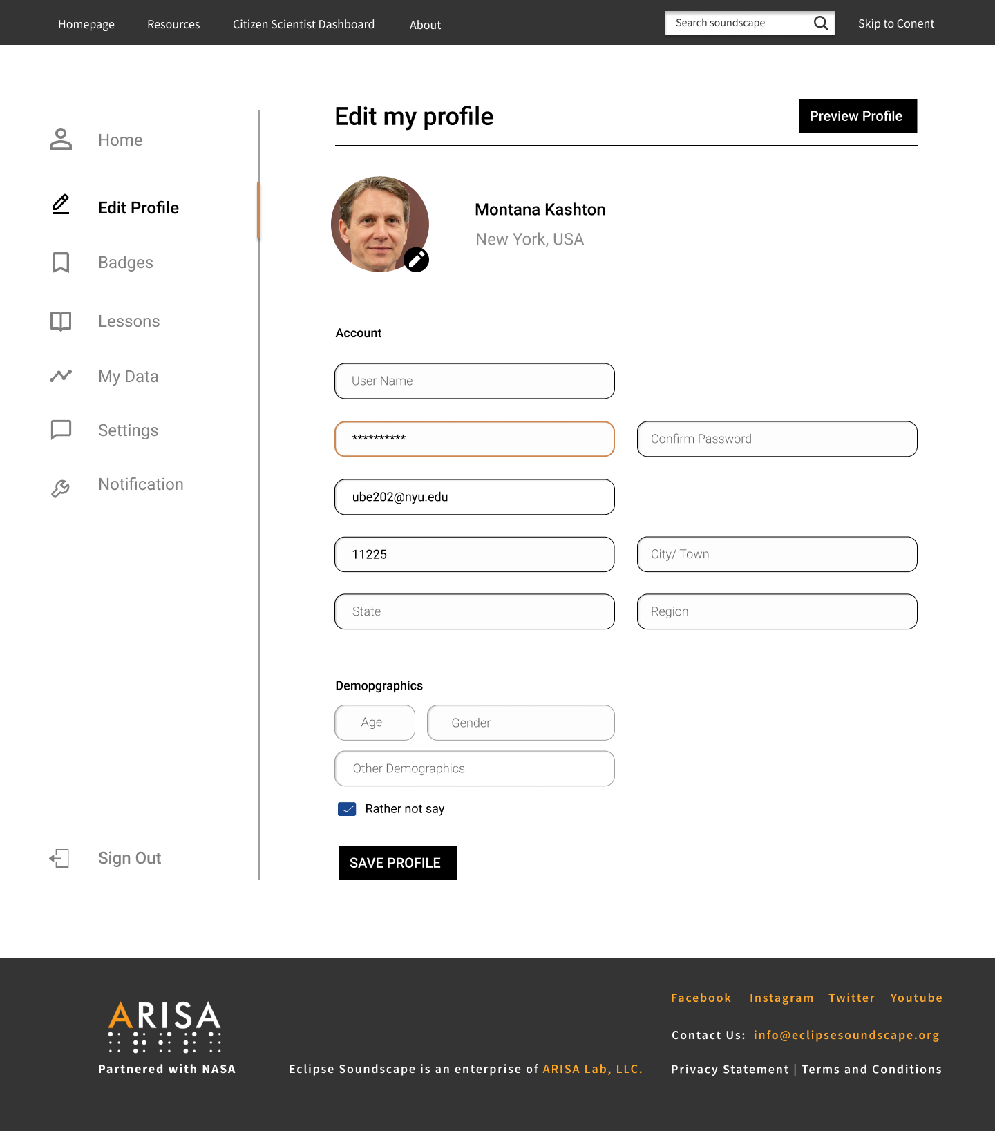
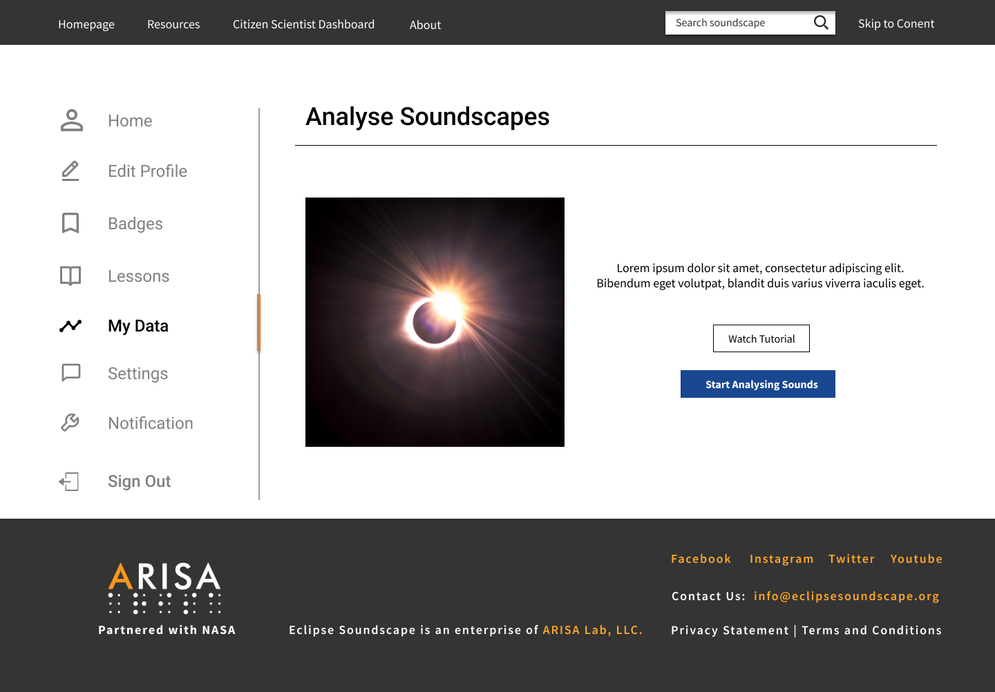
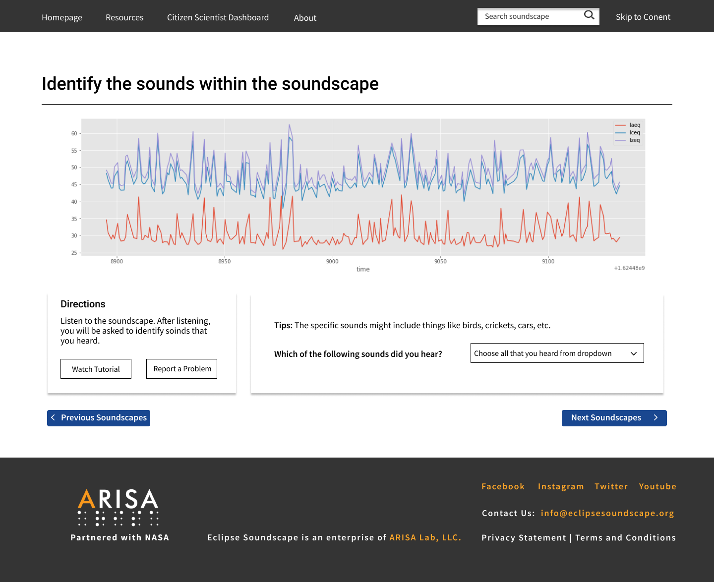
DESIGN PROCESS
1. Feature Prioritization

2. User Flow
The site has five types of users: citizen scientists, educators, learners, casual soundscape e-browsers, and soundscapes data analysts. Below are the user flows for the data analysts.
.
3. Wireframe
4. Style Guide

5. High-fidelity prototype


In the Future
In order to optimize the current version of the design, an iterative process will be repeated in the future, which will involve further participatory design with the blind and low vision communities, and usability testing.
1.Participatory design with the blind and low-vision communities
In the future, the blind and low-vision communities will be involved in the design process. Their involvement will help map their current experiences, unarticulated needs, pain points, frustrations, challenges, and areas for opportunity, thus come up with an inclusive solutions that better meet their expectations
2.Remote Moderated Usability Testing
Due to the pandemic, one way to conduct usability testing is through remote moderated research3. The participants could share his/her screen with the researcher, which displays all of her information to the researcher and observers, the researcher interviews the participant and watches his/ her behavior using screen-sharing software. Compared to in-person usability tests that take place in a controlled lab setting, the participants will feel more comfortable in their own natural setting which helps the researcher collect more accurate data.
Reference
1.Data Visualization Accessibility: Where Are We Now, and What’s Next?
https://medium.com/nightingale/data-visualization-accessibility-where-are-we-now-and-whats-next-b2c9eeac4e8b
2.WCAG 2.0 Guidelines:
https://www.w3.org/TR/WCAG20/
3.Bella Martin and Bruce Hanington, Universal Methods of Design